2019. 1. 7. 16:00ㆍ디자인/Resources

According to Tufte, the visualized information must be ‘Confection’, which refers to the technique of expressing richer stories by putting together nouns, verbs and story flows that are distributed at different points in time and space on a flatland. In other words, visual confection is a SUPER SET of visual images, text, numbers, stories and related information.
At the end of the book ‘Visual Explanation’, he said,
“Confectionary designs are a similar gift to understanding. Like perspective, confections give the mind an eye. Confections place selected, diverse images into the narrative context of a coherent argument. And, by virtue of the architecture of their arguments, confections make reading and seeing and thinking identical.”
Tufte emphasized that confections make reading and seeing and thinking identical. More specifically to use his words, ‘structures that organize information should be transparent, straightforward, obvious, natural, ordinary, conventional – with no need for hesitation or questioning on the part of the reader’.
As this is the direction of confection(for us, infographic), the strategy to achieve this goal is ‘layering and separation’. Tufte explained this technique as the most powerful devices for reducing noise and enriching the content of displays, visually stratifying various aspects of the data. He emphasized to distinguish layers by shape, contrast, size and color differences, to reduce the color of the grid to sort data, but not to imprison them, and to prevent various information from fighting at the same visual level. In addition, he presented friendly a way of using colors, such as not using too many intense colors, using it to emphasize certain things, or use gray mixed colors for background.
His advice on layering, separation and color was immediately applied to my infographic. By changing the background color to a gray mixed color, which tone was similar to paper, I reduced the visual noise. The titles of each components were painted with a highlighter so that the components could be clearly divided without a visible grid. Instead, I reduced the transparency of highlight colors not to make it too loud. I wrote annotations with red color and the special font in distinction from the body.
-
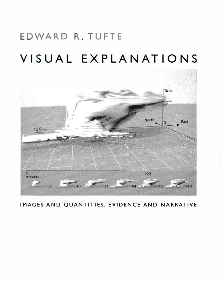
In fact, I was very surprised to see how compressed information and figures can be on a flatland. By building several axes, he could create a multi-layered dimension in a flatland, which showed that the reader could read information from a micro- and macro-view. At this point, it was important to provide readers with hints to quickly decode the confection. The reader can be interested and fascinated to the detailed and complex confection as long as he catches the hint quickly. In this regard, I realized that my work was very simple and just one-dimensional. It could have been more compressed with a wit.
I’m going to bring up a story in a slightly different context. It is Naver’s ‘Design’ story. Naver started using '설계’ instead of '디자인’ from 2016. Design is not just a visual expression, it is redefining that it includes identifying people’s needs and designing how they use them.
While reading Tufte’s various design principles and strategies, it becomes clear that my previous understanding of 'design’ meant only a visual expression. Examining Snow’s ‘The Cholera Epidemic in London’, I could fully understand, it is critical to producing successful results that how carefully the designer should understand and deal with data.
'디자인 > Resources' 카테고리의 다른 글
| Data Visualization Reading Responses (0) | 2019.01.09 |
|---|---|
| 색상 검색 엔진, Picular (0) | 2019.01.06 |
| 폰트 검색 사이트 '눈누', '한글꼴큰사전' (0) | 2019.01.05 |
| Infographic Maker 'Vennage' : 24-Hours Cafes (0) | 2019.01.04 |
| Braile Neue : A Universal Typeface (0) | 2019.01.03 |